下面的中文是使用百度翻译出来的,大家将就着看。。如有翻译问题,请找百度!
=======================================================
It’s me again, Matus. Several people have asked me how to model a pillow in Rhinoceros similar to that which I have been using in some of my scenes. Instead of just sharing this model I am going to show you how to do it! For modelling part click here (Part1). In this part you can see how to texture map the pillow, set up the scene, render it and how to tweak up final image in Photoshop postproduction.
又是我,马特斯。有人问我如何模型枕在犀牛相似,我一直使用我的一些场景。 而不只是分享这个模型,我要告诉你怎么做!建模部分点击这里(上)。在这一部分,你可以看到如何纹理贴图的枕头,设置情景,使它和如何调整了最终图像后期PS图象处理软件。
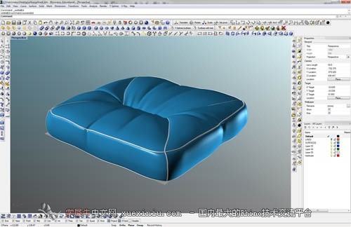
Okay, let’s start! This is the pillow I have from the last step. I have switched from Rhinoceros 5 (now in WIP version) to Rhinoceros 4, where I have my V-ray engine installed. There was no problem in saving it in R4 format and I haven’t seen any mesh or geometry problems, so switching between these two Rhinoceros versions (R4 and R5) appears flawless.
好,让我们开始!这是我的最后一步,枕头。我已把犀牛5(现在的在制品版)到犀牛4,我有我的安装的安装。也没有问题,在保存在点格式,我没有看到任何网格或几何的问题,所以之间切换这些犀牛版本(R 4和5)似乎完美无瑕。
In this picture you can see my settings for fabric material – it has got Diffuse and Bump maps, and of course – reflection layer with very low values. Set Reflection Glossiness to 0.4 and Highlight Glossiness to 0.2. Top up subdivs from 8 to 22. Rendertime is going to be longer by topping up last value, but you will get much better effect than with value of 8. Bump Map multiplier is set to 3, to get “higher” and more realistic effect.
在这个图片里你能看到我的设置织物材料–它有弥漫性和凹凸贴图,当然–反射层非常低的值。设置反射光泽0.4和突出的光泽度0.2。从8到22的最高细分。rendertime将会更长的补足过去的价值,但你会得到更好的效果比价值8。凹凸贴图的乘数为3,得到“高”和更逼真的效果。

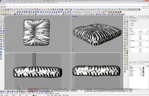
Now pick your favorite fabric texture and apply it to your model. I chose this one not because it is my favorite, but because this will show me very well how the model is texture mapped. It looks creepy, probably, but do not hesitate!
现在选择你最喜欢的织物纹理和应用到您的模型。我选择了这一个,不是因为它是我最喜欢的,但因为这会让我很好的模型,纹理映射。它看起来令人毛骨悚然的,也许,但不要犹豫!

Click Texture Mapping option in Rhino, select Custom Mapping and check values under UVW repeat. All of them are set to 1. Check also UVW rotation, where all values are set to 0 by default.
单击纹理映射选项的犀牛,选择自定义映射和检查中的重复值。他们都被设置为1。检查中旋转,在所有的值是默认设置为0。

Adjust W rotation for every single surface until you are satisfied with the result. Usually values like 90 and -90 degrees are the best values for this. I am satisfied with values of 1 in UVW Repeat, so I am not going to change them in this step.
旋转调整瓦特每一表面,直到您满意的结果。通常值90和- 90度的最佳值,这。我很满意的1价值观中的重复,所以我不打算改变他们在这一步。
In here I’ve made special material for “pipes” – for parts where I used Pipe command. Check it out here: It has only a diffuse color and strong bump map (multiplier 4).
在这里我特别为“管”–零件,我用管道命令。看看这里:它只是一个弥漫性色彩和强烈的凹凸贴图(4倍)。

And that’s all for mapping textures. After next few steps I will get back to mapping options, but now I am going to set up the scene. The scene is very very simple. Have a look:
而这一切的映射纹理。接下来的几个步骤后,我将返回映射选项,但是现在我要设立现场。现场是非常简单的。看一看:
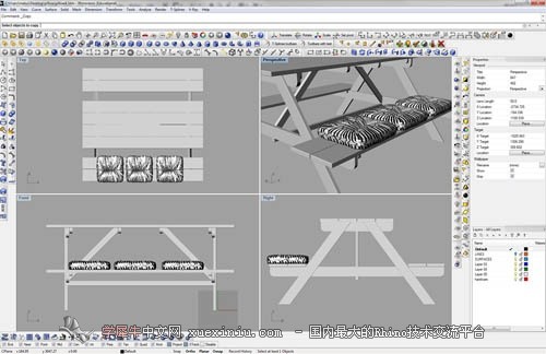
Let’s make some ground. Add V-ray Infinite Plane and make the square floor, like you can see in the image.
让我们做一些地。添加型无限平面和方形的地板,你可以看到图像。
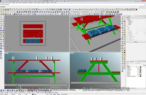
Here I have changed the materials of the pillows to make them look less uniform. Change the textures and check the surfaces and their mapping – in this step I have changed Repeat values to fix textures deforming on their surfaces. These values really depend on what size and ratio of your texture is, so please try to tweak it on your own.
在这里,我已经改变了材料的枕头,使它们看起来不统一。变化的纹理和检查表面的映射–在这一步,我已经改变了重复值固定在其表面纹理变形。这些价值观真的取决于大小和比例的纹理,所以请尝试调整它自己。

In the scene is only one light – V-ray sun. Set the multiplier to 0.5 and adjust its position in the scene.
在现场只有一个–型太阳。设置乘数0.5和调整其位置在现场。

In this screenshot you can see my complete V-ray Render Options: As you can see, my Irradiance Map is very low, Min and Max rate: both at -3 (only 1 prepass!) and only 20 samples. This will make my render very quick. I always use Physical camera, no matter what. In Environment section set your Sun light (usually Light 01) into GI and Background. Switch from Adaptive Subdivision to Adaptive DMC and turn your Antialiasing ON. Don’t forget to check Sub-pixel box under Color Mapping.
在这张截图中你可以看到我 完成安装的渲染选项:你可以看到,我的照度很低,最小和最大速率:在- 3(只有1 prepass!)只有20个样本。这将使我非常快。我总是用物理相机,无论什么。在环境设置你的太阳光(通常01)在胃肠道和背景。从自适应细分自适应,把抗锯齿上。不要忘记检查像素框下的色彩映射。
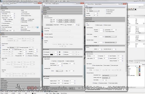
Render the scene. Rendering took maybe only 1 and a half minute at 800×954 pixels thanks to low Irradiance map. Safe the frame as HDR for better postproduction!
渲染场景。绘制了也许只有1分半钟的800×954像素,由于低辐射地图。安全框架为人类更好的后期制作!

Open up Photoshop. Click IMAGE>MODE>16bit. Now turn your Gamma Value to 2.2 and move Exposure slider as you want. Now you are in 16 bit mode and you can use all the Photoshop adjusting effects. (You can use only some of them in 32-bit mode). As you can see, I’ve used Vibrance, Curves, Levels and Color balance effects. How the scene looks like depends on your monitor settings, so use the sliders until your image is really nice :)
I’ve also created some Vignetting effect. If you are using this step as I do, use dark blue color (sth like #041b36) for vignette layer.
You can also see Z-depth layer in my picture. This layer I have drawn myself. You can choose to generate it straight in V-ray channels option, but I decided to make my own. By generating a V-ray Z-depth channel you get physically correct blur in Photoshop, but what I wanted to do was to have an absolutely sharp first pillow, a slightly blurred second pillow and a heavily blurred last pillow, so I drew it using black, grey and white. Then I’ve used a very strong Gaussian blur value for this layer. After this, duplicate the layer with the pillows, go to CHANNELS, create new layer and paste previously drawn B&W layer. Now go to FILTER>BLUR>LENS BLUR. Now you can easily adjust Lens length and amount of blur using the B&W layer you have drawn! When you are satisfied, click OK an save your image :)
打开PS图象处理软件。点击图像> > 16位模式。现在您的伽玛值为2.2,只要你想接触滑块。现在你是在16位模式,你可以使用所有的PS图象处理软件的调整作用。(你可以只使用其中的一些32位模式)。你可以看到,我已经用振动,曲线,层次和色彩平衡的影响。如何现场看起来像取决于您的显示器设置,所以使用滑块直到你的形象是非常好的:) 我也创建了一些渐晕效应。如果您使用的是这一步我一样,用深蓝色的颜色(某事像# 041b36晕影层)。 你也可以看到,直深入层在我的图片。这一层我得出自己。你可以选择生成直型通道选择,但我决定让我自己。通过生成一个通道型直深入你身体正确的模糊在PS图象处理软件,但我想做的是有一个绝对锋利的第一个枕头,略微模糊的二枕和重模糊上枕头,所以我把它用黑色,灰色和白色。然后我用很强的高斯模糊值为这一层。在此之后,复制图层的枕头,到渠道,创建新的图层并粘贴以前的黑白层。现在去滤镜>模糊>镜头模糊。现在您可以轻松地调整镜头的长度和数量的模糊使用黑白层你画的!当你感到满意,点击可以保存您的形象:)
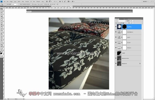
Now if you want to save your image, you can’t save it as JPG file. It’s because you are still in 16-bit mode. Go to IMAGE>MODE>8bit. Now you can save your image as JPG file.
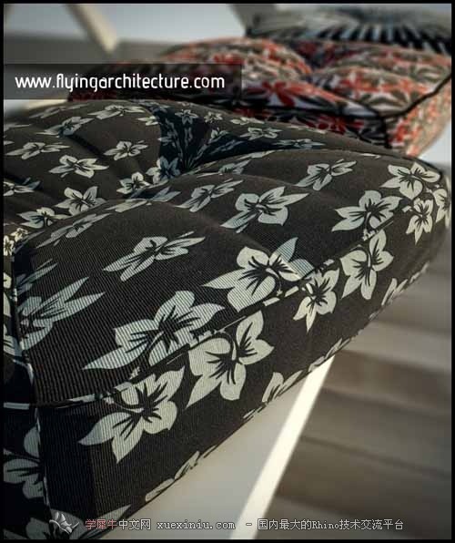
And here is the final render with Adjustments in Photoshop. What do you think? Do you like it?
If you like my effort and this tutorial, or models helped you at least a little bit, please consider donation via PayPal :) If you want to support me, just click the PayPal banner in the right sidebar. Thanks a lot!
现在,如果你想保存你的形象,你不能保存为文件。这是因为你仍然在16位模式。到图像“> > 8位模式。现在你可以保存您的图像文件。
这里是最终使调整PS图象处理软件。你的意见呢?你喜欢吗? 如果你喜欢我的努力和本教程,或帮助你至少有一点,请考虑捐赠通过贝宝:)如果你想支持我,只需点击贝宝旗帜在右栏。多谢了!

|
联系把:1214623183
举报